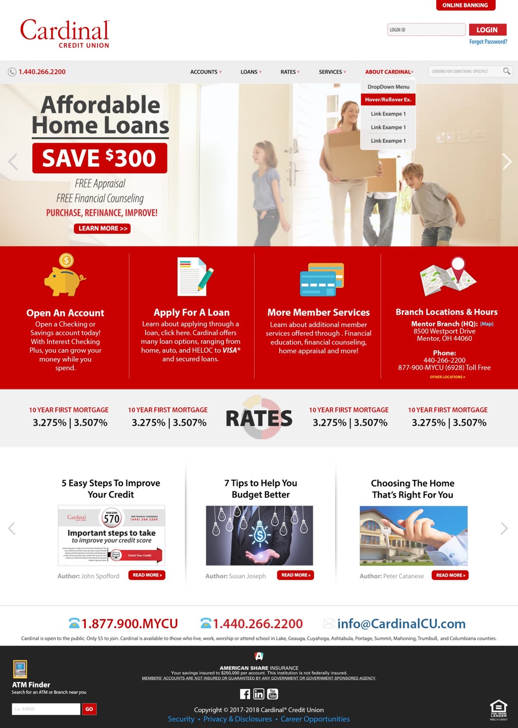
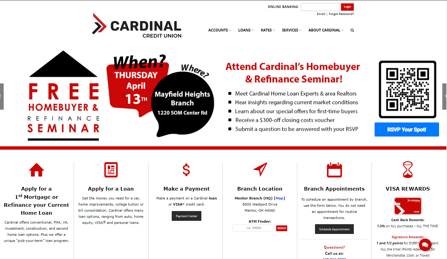
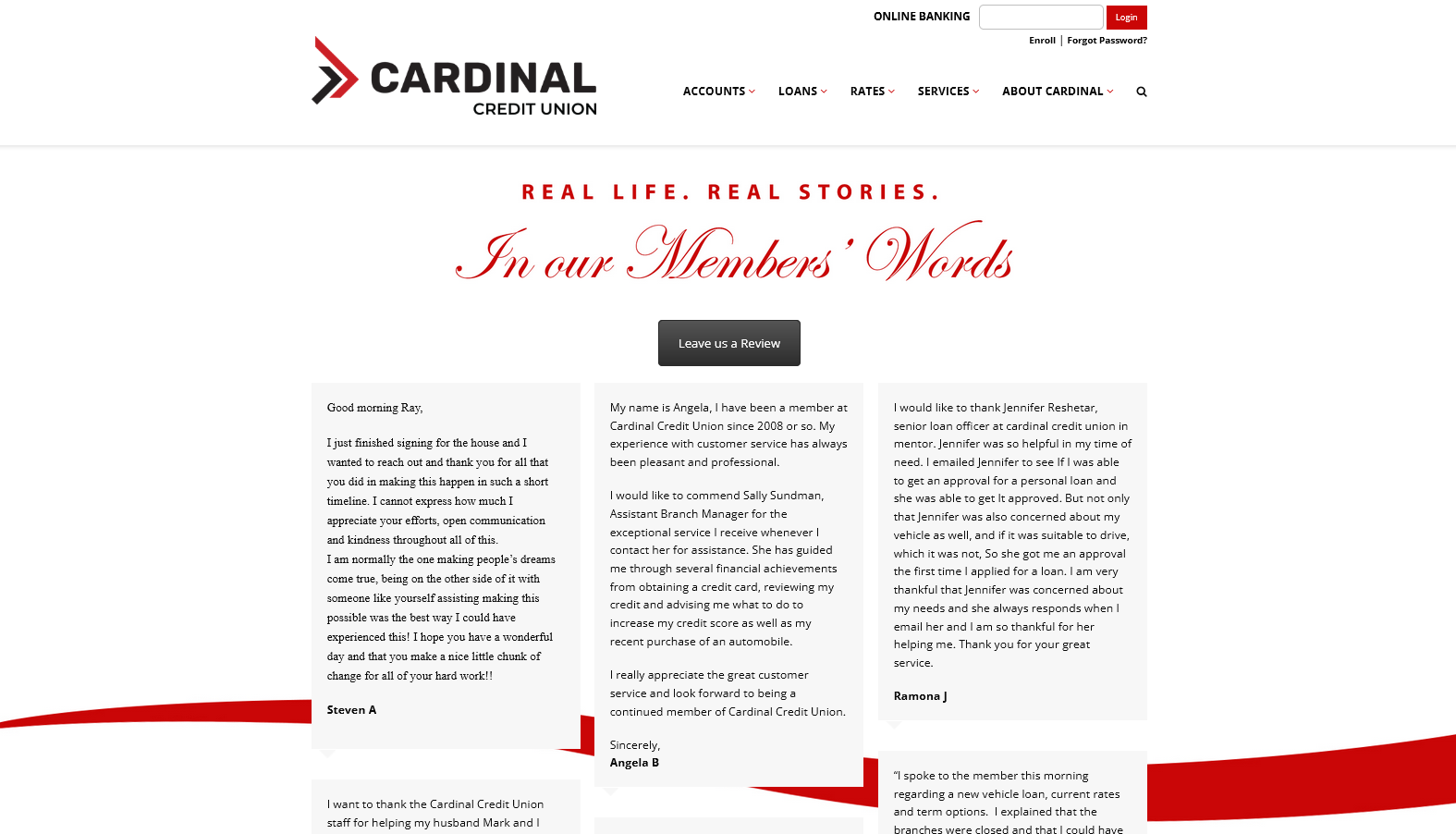
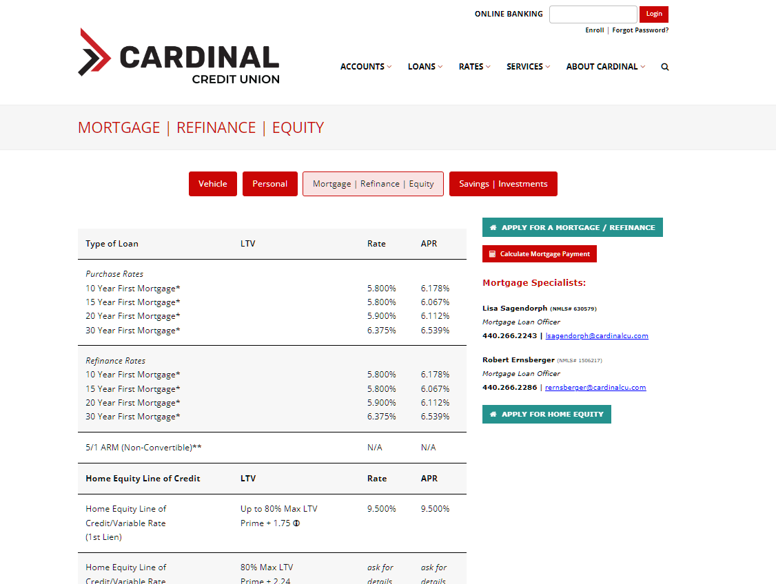
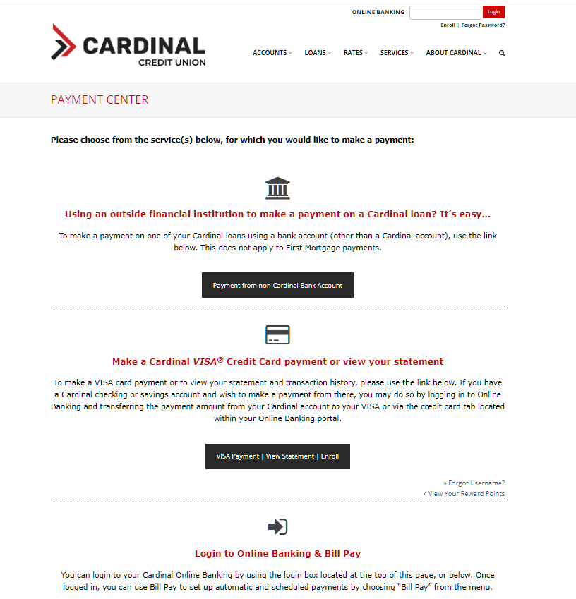
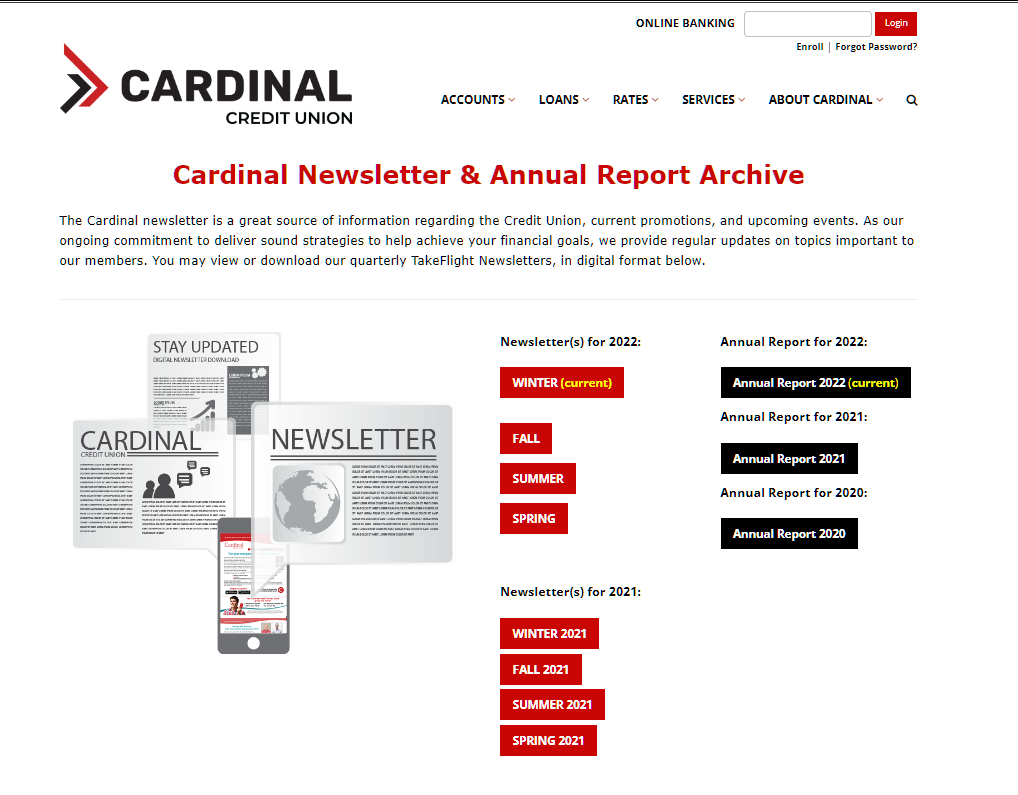
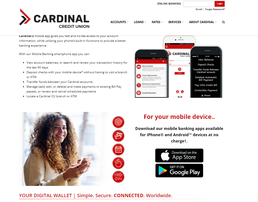
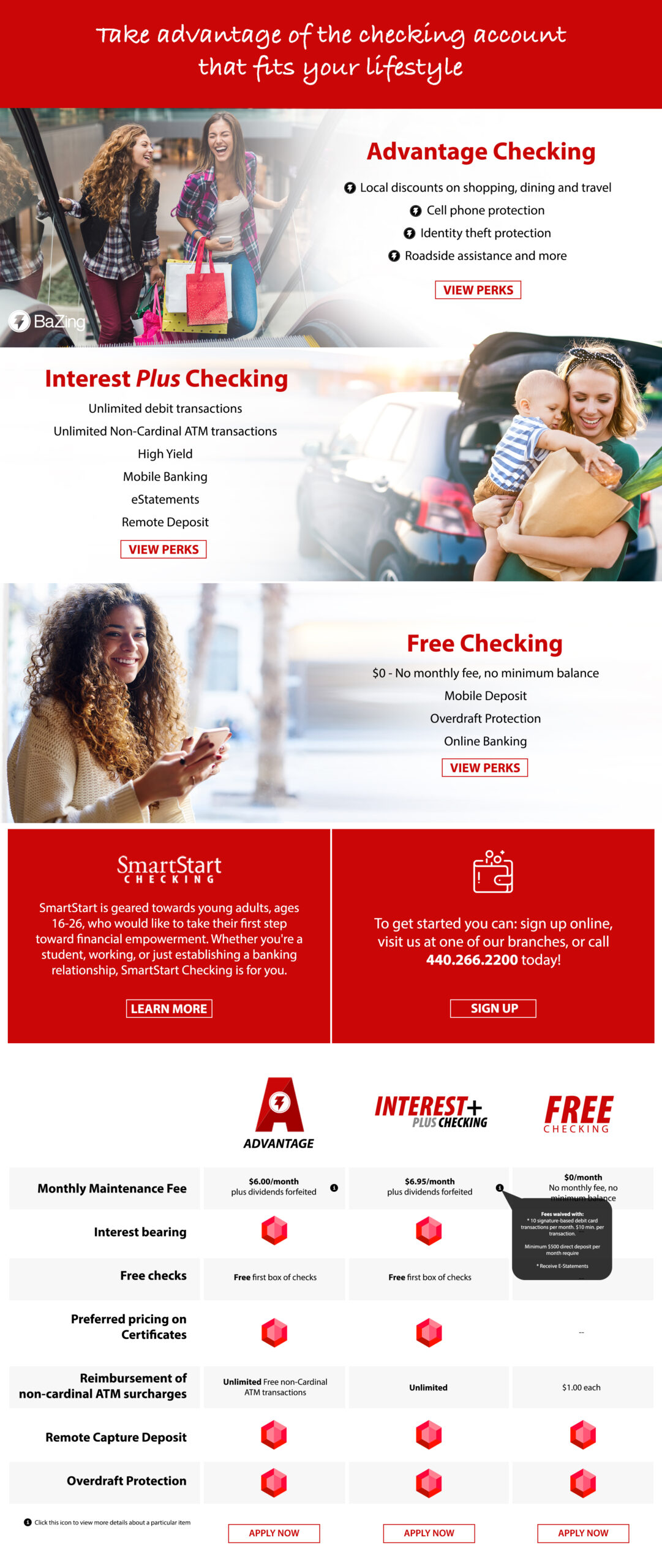
When I joined Cardinal Credit Union’s marketing department, their website had a dated, late 90s look and a backend that was difficult to manage. I made it my mission to give the site a complete overhaul and bring it up to date with a fresh, modern look. I redesigned every page from the ground up, paying close attention to user-friendliness for all demographics, including older users who may be less technically inclined. I also took on the challenge of redesigning the payment center multiple times until it was clear and easy to use, resulting in a significant reduction in user confusion and support calls. Every aspect of the design and functionality was done by me, and the result was a refreshed and user-friendly website that met the needs of Cardinal’s members and staff alike.
These images illustrate the concept and initial graphical mockup to the final live website.
